Nov 16 2016
I was guilty of blinking text.
I have worked in a library for nearly 19 years but I’m not a librarian. I began working at the Putnam County library doing typical library stuff – shelving books, checking books in, checking them out, helping with random questions, and learning how to “deal” with every personality (and mental disease) known to man. Once my supervisor found out I was working on my Computer Science degree she allowed me to work on the library’s website. My first website was so very hideous! It was all about how many new cool things I could do! I created it in Microsoft FrontPage (discontinued WYSIWYG HTML editor) which allowed me to easily apply over 1000 different background images, moving Gifs, blinking text, fancy trailing pointer movement, and neon colors. Ok – so I am exaggerating a little (but really….it was bad).
Through attending classes at TTU and some tough love from my good friends I learned that the website I had created was difficult to read and really just annoying. So I taught myself how to create a clean, readable website that wouldn’t cause seizures.
The biggest lesson I have learned while working for libraries all these years is how to focus on our users. If we did not have people using our services and materials, then we would absolutely not have any purpose. Now I work at the TTU library as Web Manager and a few years ago I was looking very critically at the library website’s usage data and it left me with a lot of questions I couldn’t answer!
- Do users find what they are looking for?
- Do users have an easy time finding what they are looking for?
- Do users move from being a novice to being a skilled user in a short amount of time?
- Are users satisfied with the website?
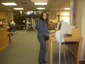
I learned that the best way to really know how usable your website is to watch people using it! I picked a few lucky co-workers to help me with a usability study and we came up with a set of tasks for each participant to perform. In Fall 2015, we recruited TTU faculty, undergraduate students, and graduate students to participate in our study. They would come to the library and sit at a computer to complete the tasks. When they would get a task wrong, I would shock them with electricity. Just kidding! We used super-fancy usability testing software and it would record the screen, mouse movements, and video the person while they did the tasks. It was unbelievable how much we could learn from just one participant in 20 minutes. For example, we learned we were using too much library lingo like “InterLibrary Loan” and also that users had a difficult time finding the library website from TTU’s home page! We plan to do another study in Fall 2017 to work on our library search tool – EagleSearch – and I can’t wait to find out the results! We might even change it to where participants get cookies for right answers instead of shocking them for wrong answers (positive reinforcement).
The library’s usability study has made me so much more aware of user experience in my instruction to students as well. I teach Introduction to Problem Solving and Computer Programming in the Computer Science department and if you ask my students I am sure they will tell you that I (annoyingly) repeat how important it is to make sure your program is usable and fun. You can’t just assume that every user thinks the same way you do and you should make sure that the user knows what they are supposed to do with your program. I encourage students to watch their friends run their programs. You may be in tears by the end of it but at least you know how usable your program is! My hope is that I am doing my part to prevent hideous, un-user-friendly websites (and software) to enter the world.
Comments Off on I was guilty of blinking text.